We embody our corporate ethos by actively striving for significant progress through our mission and CI.
-
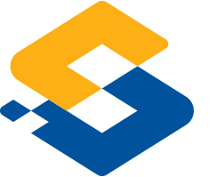
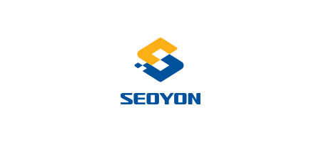
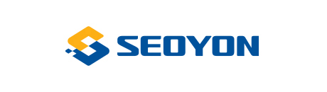
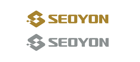
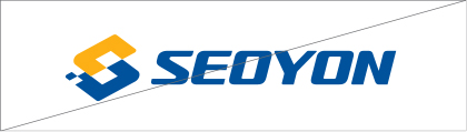
- Corporate Symbol
- The overall representation of the IDENTITY MARK perpetuates the entrepreneurial spirit by integrating five diamonds, symbolizing harmony, value realization, respect for human beings, and trust, into a unified entity. The YELLOW-COLORED diamond shape embodies love, sharing, and people-centered ethical management, while the blue diamond symbolizes a global vision for the future and trust. The two visionary diamonds that emerge upon the fusion of the two colored diamonds encapsulate the determination to cultivate enhanced global synergy. The MARK’s shape and the S initial are artistically presented, with the S representing SEOYON’s innovative smart management and a commitment to fostering greater synergy. Furthermore, the CI encapsulates the significance of public interest, signifying SEOYON’s renewed identity spirit in fulfilling its responsibilities in automobile technology and development. The vision is to establish itself as a social enterprise, aspiring to lead the global market.
Terms of Use
-
-
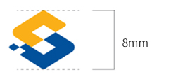
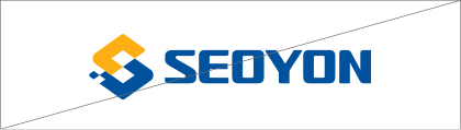
- SEOYON’s corporate symbol is utilized across all media to represent the brand and plays a vital role in shaping the company’s visual identity.
- Hence, to ensure consistent visual representation, it’s essential to preserve and employ the form and color of the corporate symbol. Minimum usage guidelines for the corporate symbol are established considering reproducibility, and use below the minimum size is discouraged wherever possible.
Logo Type
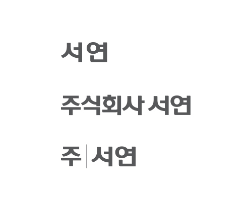
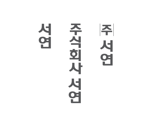
Korean
-
The Korean logotype is a distinctive design of SEOYON and should not be modified under any circumstances.
Horizontal
Vertical
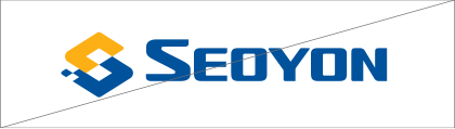
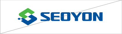
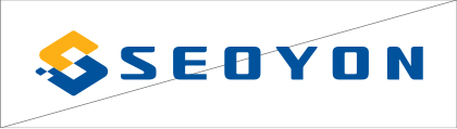
English
-
The English logotype was created in harmony with the corporate symbol and should not be modified under any circumstances, as it represents SEOYON’s unique design.
Chinese
-
As the Chinese character logotype is an original design of SEOYON, it should not be modified under any circumstances.
The vertical type is used in situations where it’s necessary to display the company name vertically, such as on vertical sign where the use of a horizontal logotype is not feasible.
Horizontal
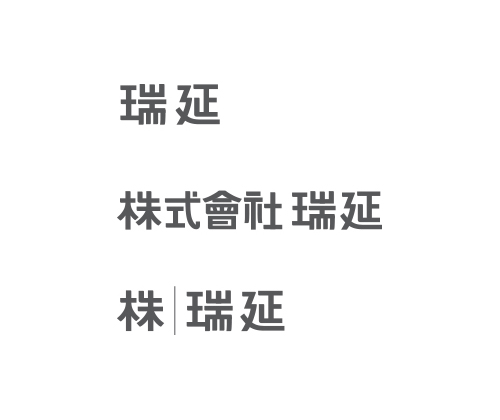
Vertical
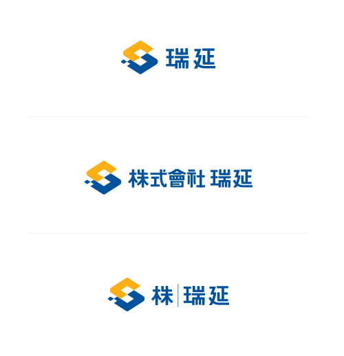
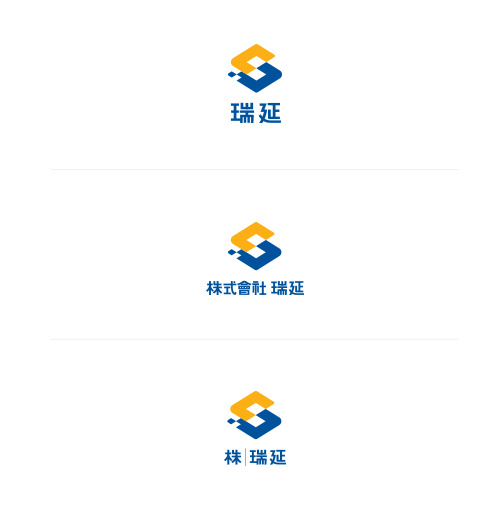
Signature
Korean
-
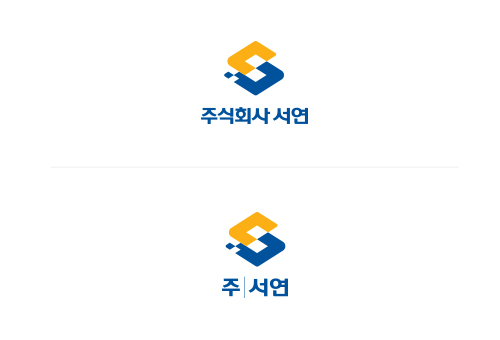
The Korean signature system is a fusion of the corporate symbol and the Korean logotype, following specific rules, and should not be altered or used arbitrarily.
Left and Right Combination Type
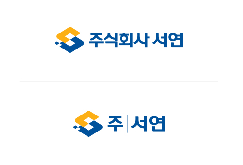
Top and Bottom Combination Type
English
-
The English signature system combines the corporate symbol and the English logotype according to specific rules and should not be modified or used arbitrarily.
Left and right combination type
Top and bottom combination type
Chinese
-
The Chinese signature system combines the corporate symbol and the Chinese logotype according to specific rules and should not be modified or used arbitrarily.
Left and right combination type
Top and bottom combination type
-
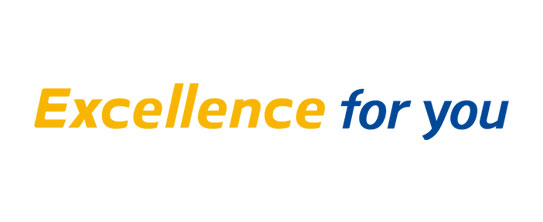
Slogan
-
The slogan is an element that embodies SEOYON’s image and aspirations in both internal and external communications. It was crafted to establish a connection with the identity.
Left and right combination type
Top and bottom combination type
-
Color standard
-
SEOYON’s exclusive color is utilized across the application and BASIC systems, serving as a critical element in creating a cohesive visual identity. The primary colors are SEOYON BLUE and SEOYON YELLOW. However, in the case of printing using the four primary colors due to the nature of the applied medium, it should be presented according to the PROCESS COLOR ratio provided below.
Main color
PANTONE 287C
R0 G80 B155 / C100 M70 Y0 K10
PANTONE 130C
R250 G175 B25 / C0 M35 Y100 K10
Secondary Color
PANTONE Coll Gray 6C
R190 G190 B190 / C0 M0 Y0 K30
PANTONE Cool Gray 11C
R110 G110 B110 / C0 M0 Y0 K70
-
Use of color
-
The optimal choice for an effective display is to use the Full Color Version of the corporate symbol on a bright background. Nonetheless, it is created to adhere to the application’s characteristics or environment for single-color expression and special printing when four-color printing is unattainable. Ensuring a consistent image use through careful color management is vital, and the symbol should not be arbitrarily altered to prevent damage to the image.
Primary Color
Grayscale
Black and white printing
Special printing
-
Color Adaptation to Background Color
-

-
Prohibition of use
-
To maintain the integrity of the identity, it’s imperative to adhere to the suggested guidelines. Altering the shape or color of the identity due to the usage of inappropriate documents or arbitrary interpretations by the user could lead to damage to the original image and a decline in the communication effect. The cases presented in this section highlight common instances of misuse by type. Managing and referencing them rigorously is essential to prevent any form of distortion.
When Size is Arbitrarily Adjusted
When a Color Other Than the Specified Color is Used
When Space Between Letters is Arbitrarily Adjusted
Slanted
Distorted shape
Used in a Specific Shape
Processed with Lines
Used Over a Strong Background Color
Intense Pattern Used Over a Photo